Economic Notes
Brief insights on the economy with key charts
Job Switching Came Back, But Not for the Young
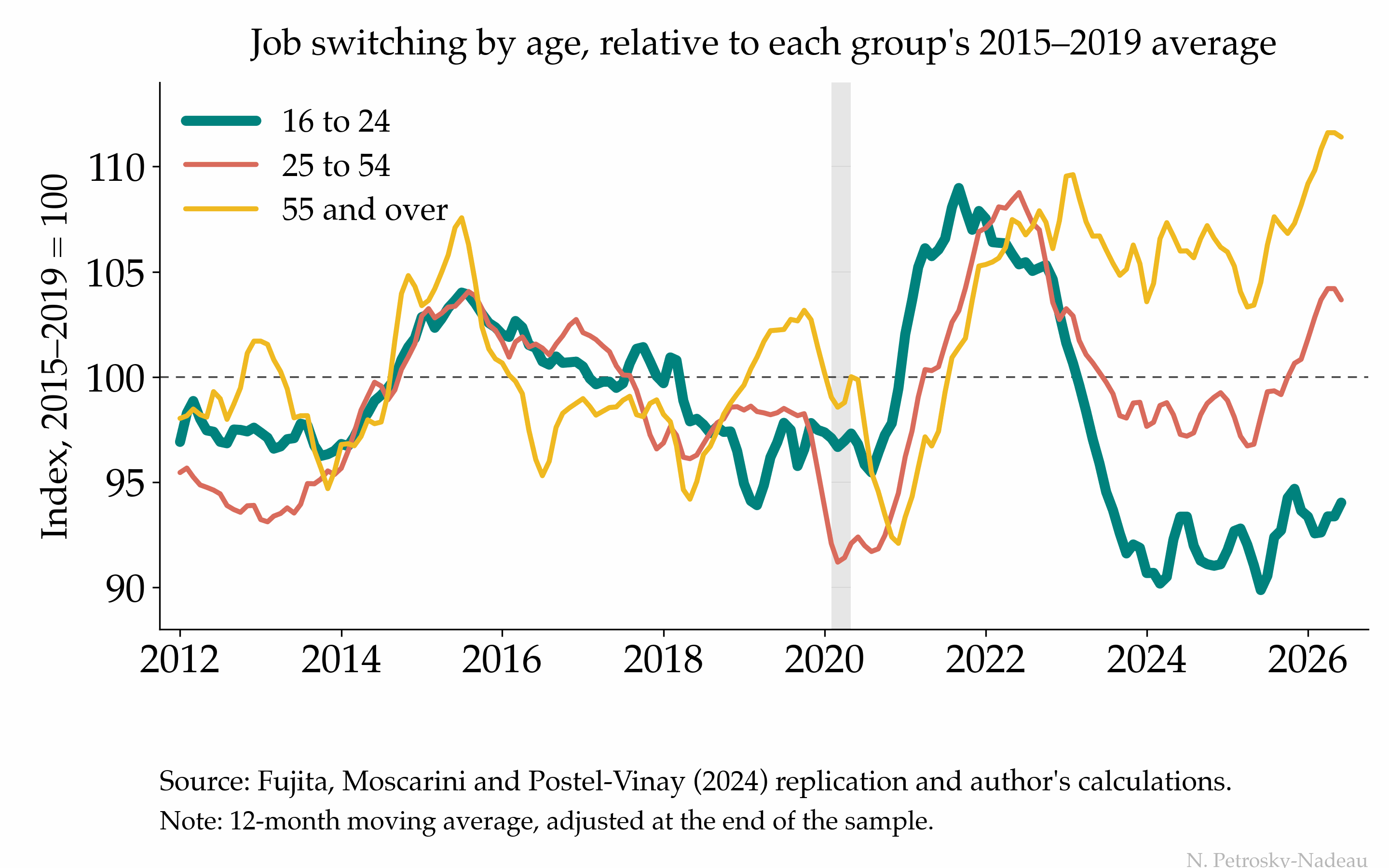
Job switching is where much early-career wage growth begins. The strong labor market of 2022 lifted it for every age group at once; the recovery since 2024 has left the young behind.
Each line is an age group’s rate of moving straight from one employer to another, measured against its own 2015–2019 average, because the levels are not comparable across groups: 16-to-24-year-olds switch employers about three times as often as workers over 55. At the 2022 peak the three ran within about three index points of each other; they have pulled apart since. The over-55s (gold) are about ten percent above their pre-pandemic norm and prime-age workers (salmon) have come back around it, while the young (teal), who bottomed ten percent below in early 2024, are still six percent short.
The series are 12-month moving averages, and the most recent stretch is computed on a shortened window, so those months can revise as the survey adds data. The downloadable file flags them.
Economic Post · September 14, 2026 · Download Data (CSV)
Two Ways to a Higher Unemployment Rate
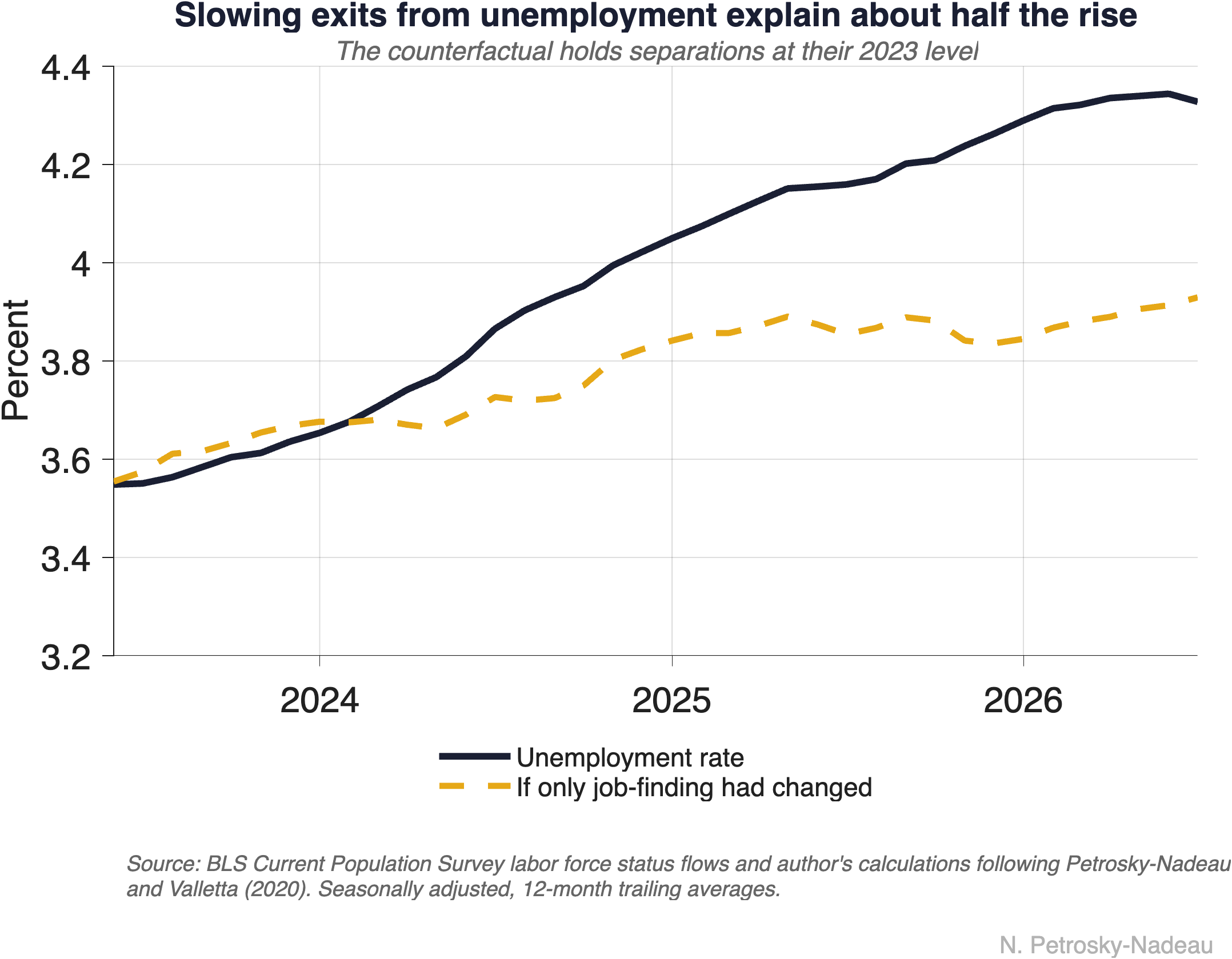
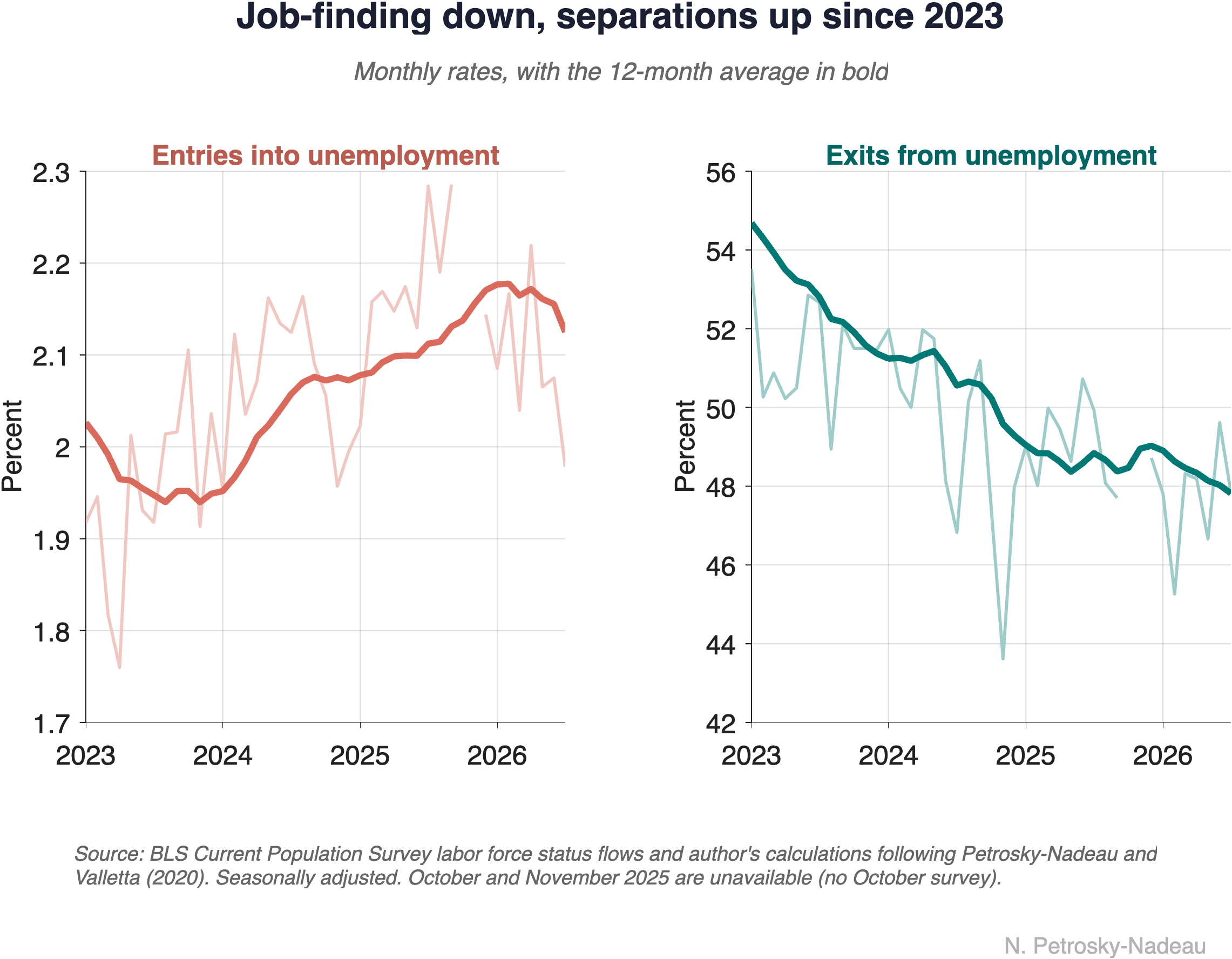
The unemployment rate was 3.6% in early 2023 and had risen to about 4.5% by the end of 2025. Two very different labor markets could produce that rise: one in which more workers are losing jobs, and one in which the unemployed are simply taking longer to find work. The headline rate cannot tell the two apart, but the monthly flows into and out of unemployment can. Both margins have moved since 2023. Holding one at its 2023 level at a time, the higher rate of entry into unemployment accounts for roughly 42% of the rise in the implied rate and slower exits for roughly 54%. The underlying series are on the Data page.
August 2026 · Economic Note 2026-08
Keeping Up with Inflation, One Job Change at a Time
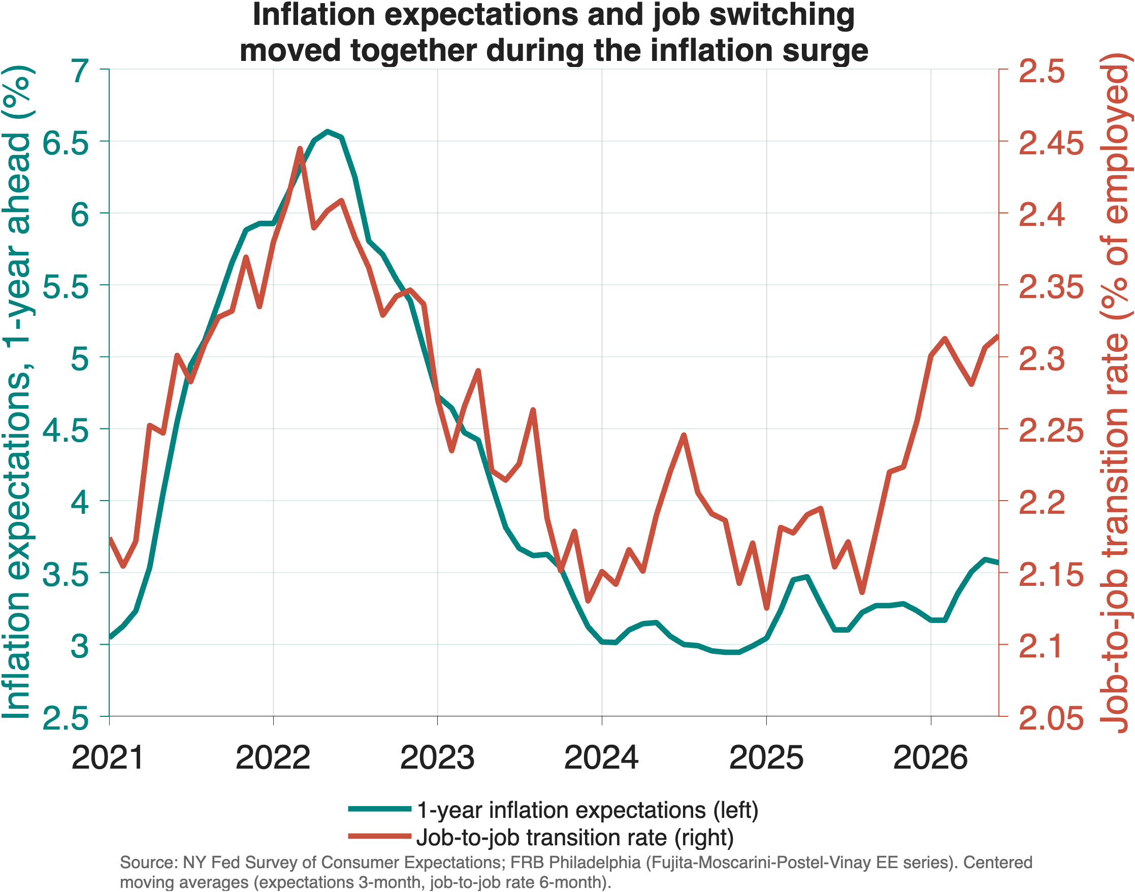
Higher inflation expectations push workers to search for new jobs when wages are set in nominal terms. In the New York Fed’s Survey of Consumer Expectations, a 1 percentage point rise in expected inflation raises the chance of searching for new work by about 0.7 percentage point, enough to account for roughly 40% of the post-pandemic increase in job-to-job transitions. The relationship fit 2021 to 2024 closely; both series have turned up again recently, though wage growth has not yet followed.
August 2026 · Economic Note 2026-07
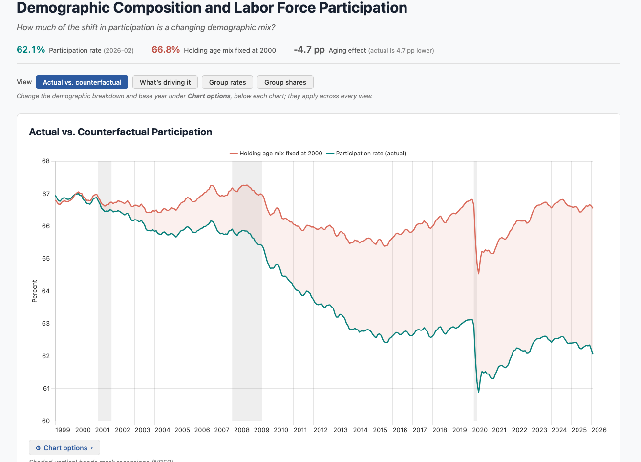
What the Overall Participation Rate Hides
The overall labor force participation rate, the share of the population working or looking for work, has fallen about 5 percentage points since 2000, which is often read as a sign that fewer Americans want to work. But an aggregate rate blends how people behave with how the population is composed. Demographic adjustment separates the two, and it shows that population aging, not weaker attachment to work, accounts for almost the entire decline. You can explore the full decomposition in the interactive dashboard on the Data page.
July 2026 · Economic Note 2026-06
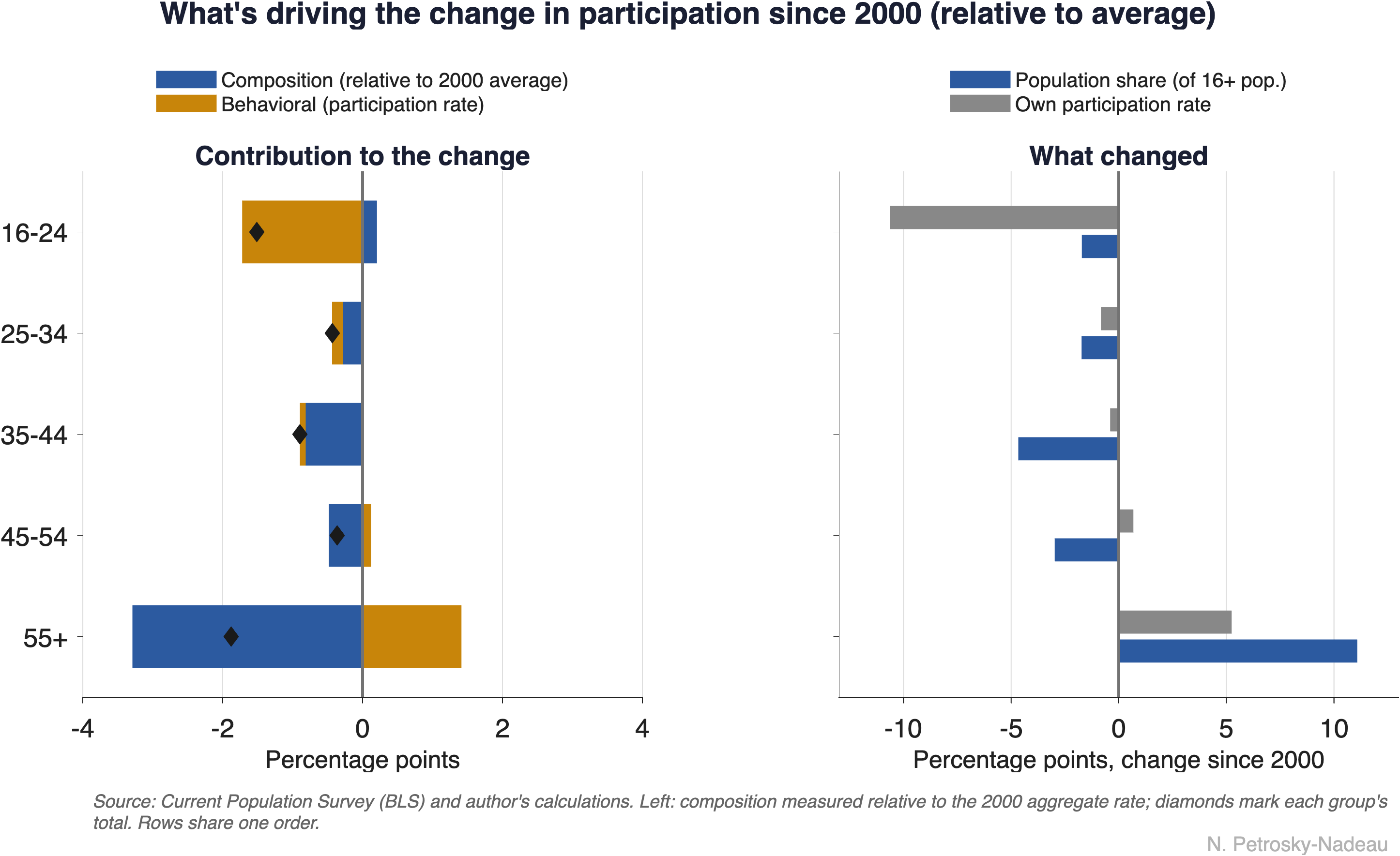
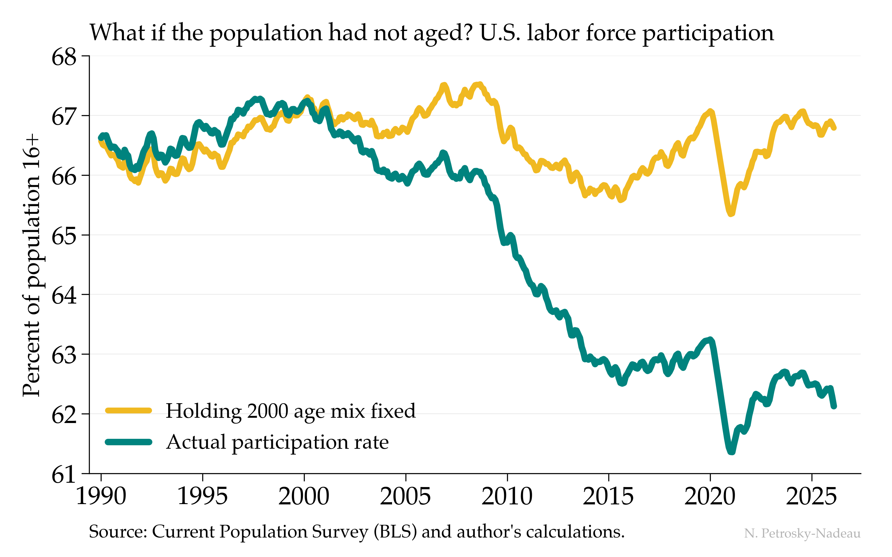
Aging, Not Attachment, Explains the Falling LFPR
I often hear that Americans are less willing to work than they used to be, pointing to a participation rate that has fallen about five points since 2000.
The teal line shows that decline, from a peak near 67% to about 62% today. The gold line asks a different question: what would participation have done if the age distribution of the population had simply stayed at its 2000 mix, with each age group participating as it actually does now? Almost nothing—it sits near 67% throughout. Nearly the entire drop is the baby-boom cohorts aging into their retirement years, not a generation stepping back from work.
Economic Post · July 14, 2026 · Download Data (CSV)
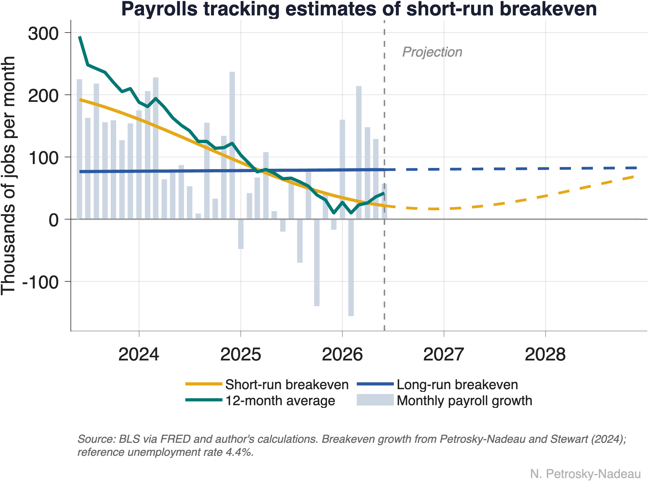
How Many Jobs Is Enough?
The most useful number to have in hand when reading the monthly jobs report may be the pace of hiring that would hold the unemployment rate steady, the “breakeven” pace. Over the past two years, job growth has cooled sharply, from roughly 150,000 to about 40,000 jobs a month, yet unemployment has changed little. The reason is that breakeven fell just as fast. Looking ahead, breakeven is set to rise again as labor force growth returns to its slower demographic trend.
July 2026 · Economic Note 2026-05
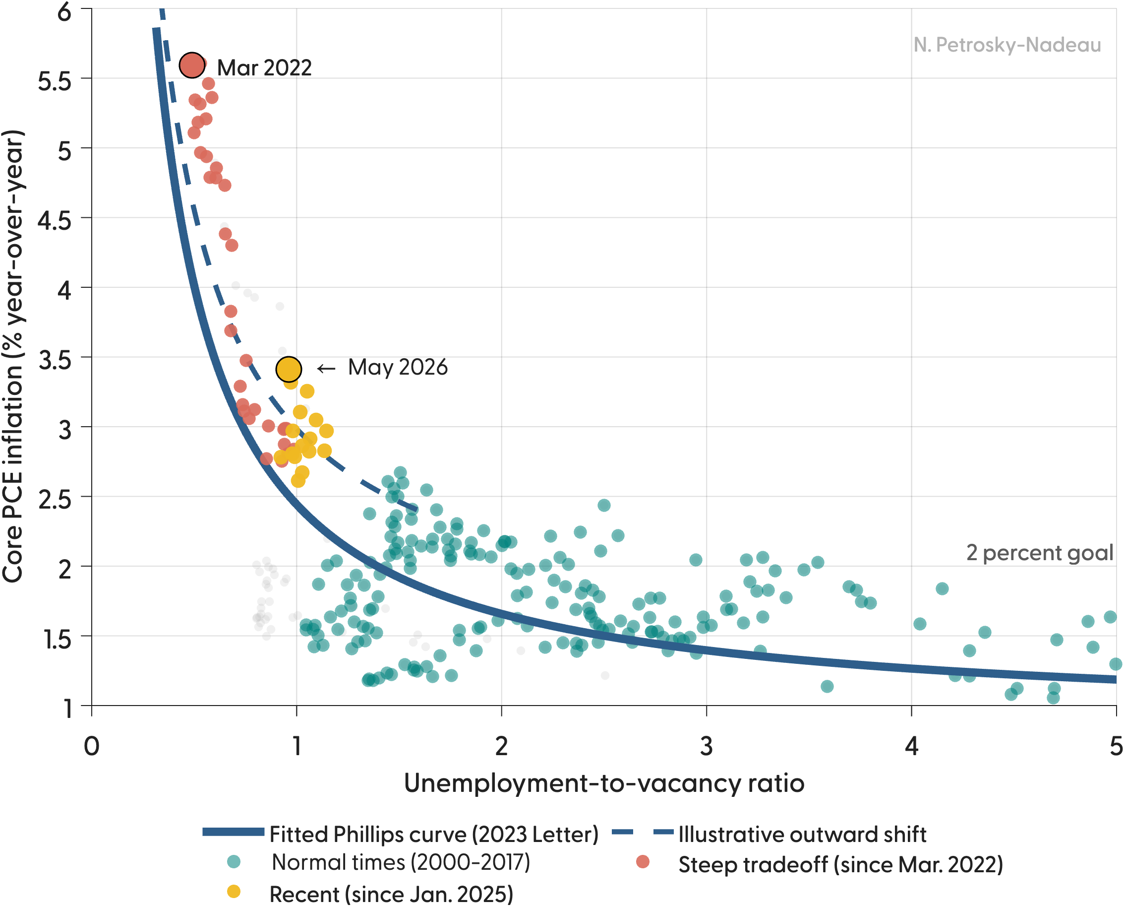
When the Curve Moves, It's Hard to Stick the Landing
In 2023, my coauthors and I mapped a soft landing down a stable Phillips curve, achieved mainly by shrinking job vacancies rather than raising unemployment. For a while, that is roughly what happened. But the readings since January 2025 no longer sit on that curve. At a fairly normal degree of labor market slack, core PCE inflation has held near 3% and climbed to 3.4% by May 2026, about 0.9 percentage point above what the 2023 curve predicts.
July 2026 · Economic Note 2026-04
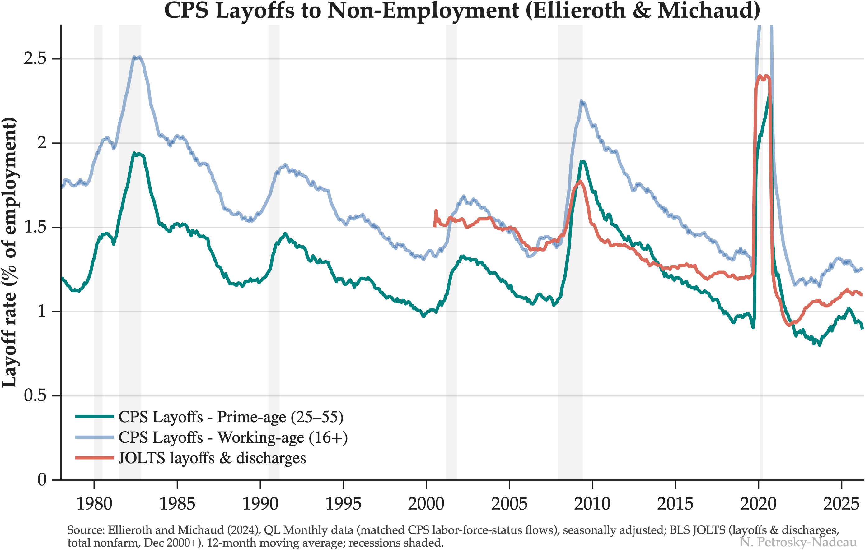
How Unusual Is Today's Low-Fire Labor Market?
Commentators describe today's labor market as “low-fire,” but that reading rests largely on JOLTS, which began only in 2000 and spans just two recessions. A household-survey layoff series reaching back to 1978 shows the layoff rate has little trend over nearly five decades once the aging of the workforce is taken into account. Today's low level among prime-age workers is close to what prior strong expansions produced.
June 2026 · Economic Note 2026-03
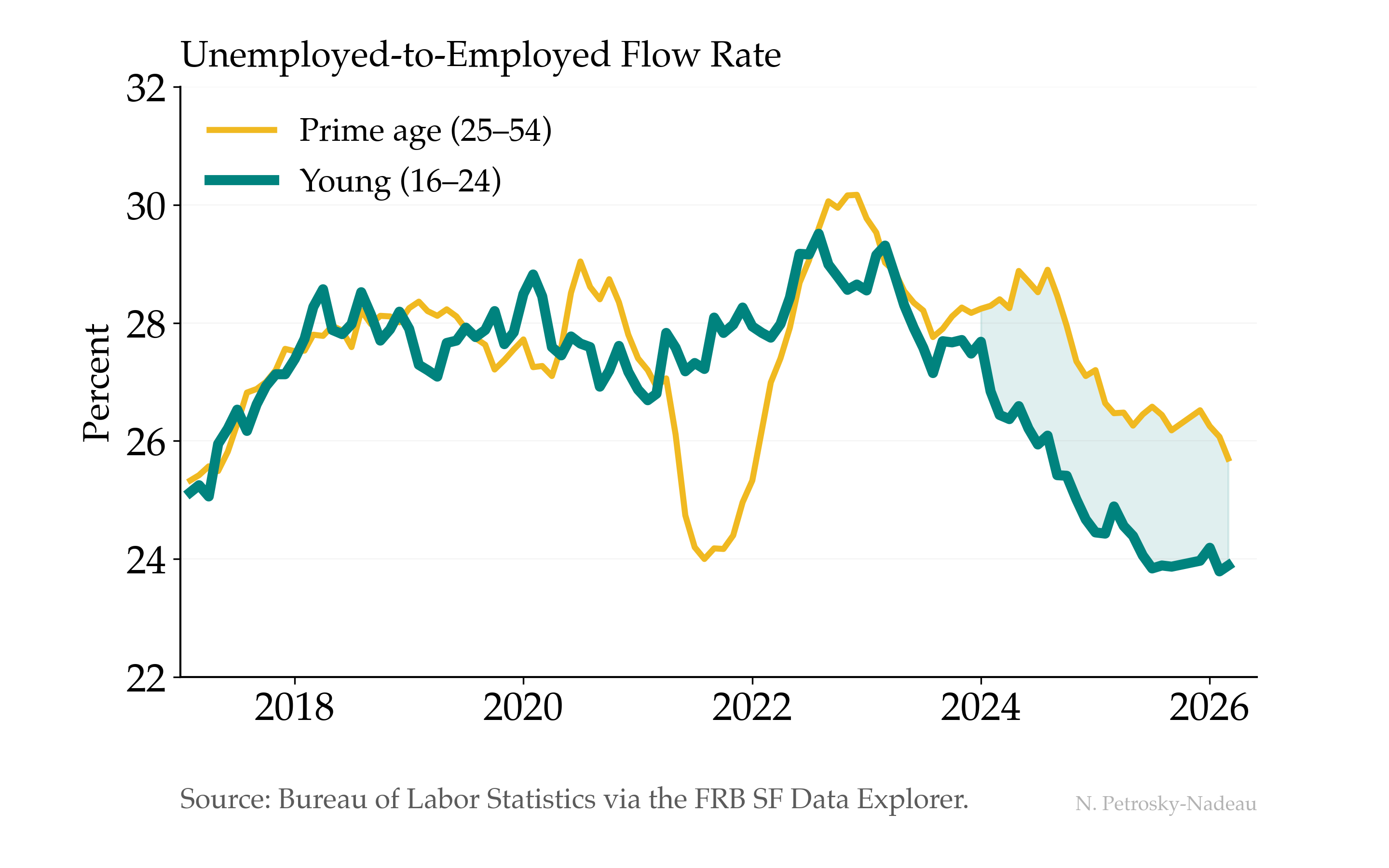
Young Workers Are Finding Fewer Jobs
When young workers describe a tougher labor market, this is what it looks like in the data.
Before the pandemic, young (16–24) and prime-age (25–54) workers found jobs at nearly the same rate—about 28% transitioned from unemployment to employment each month. That symmetry broke in 2024. Job-finding rates for young workers dropped to around 24% while prime-age workers held near 26%. The gap has persisted into 2026 with no sign of closing.
Economic Post · May 18, 2026 · Download Data (CSV)
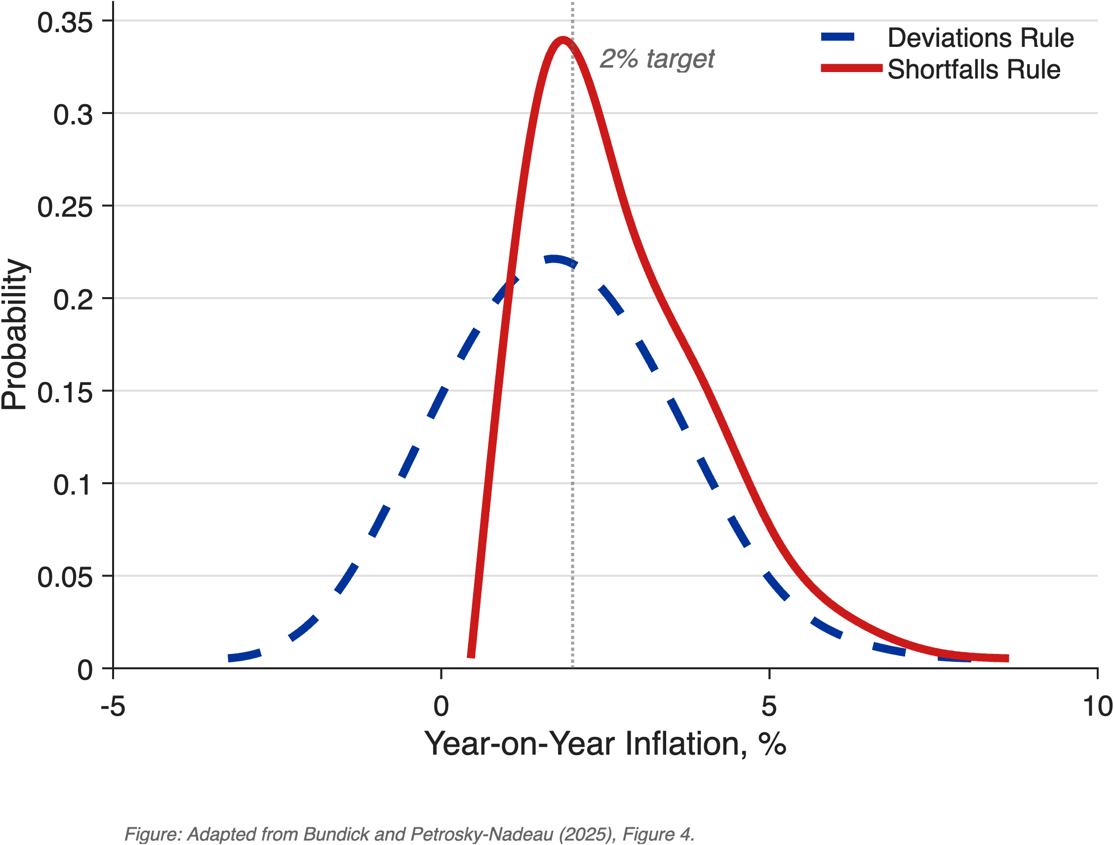
From Deviations to Shortfalls
In 2020, the Fed changed one word in its employment mandate—from “deviations” to “shortfalls.” A calibrated model shows this asymmetry raises average inflation by roughly 90 basis points but virtually eliminates episodes at the zero lower bound, dropping ZLB frequency from 26% to less than 1%.
May 2026 · Economic Note 2026-02
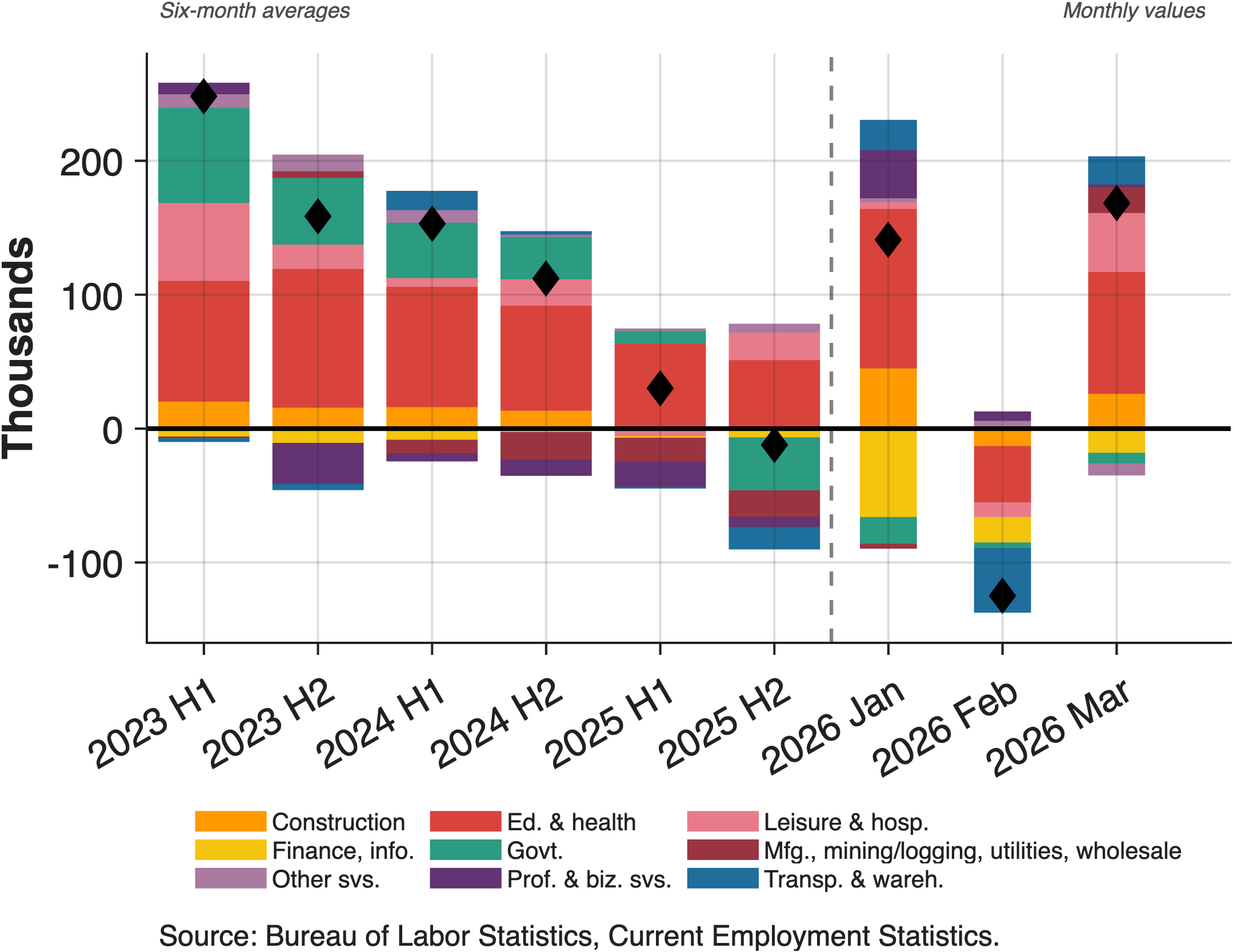
One Sector Carries the Labor Market
2026's first three months of payroll data come on the heels of concerns that job gains have been driven by a single sector in recent years. While headlines focus on overall numbers, the underlying pattern shows education and health services essentially carrying the entire labor market. Most other major sectors are either contracting or stagnant.
May 2026 · Economic Note 2026-01
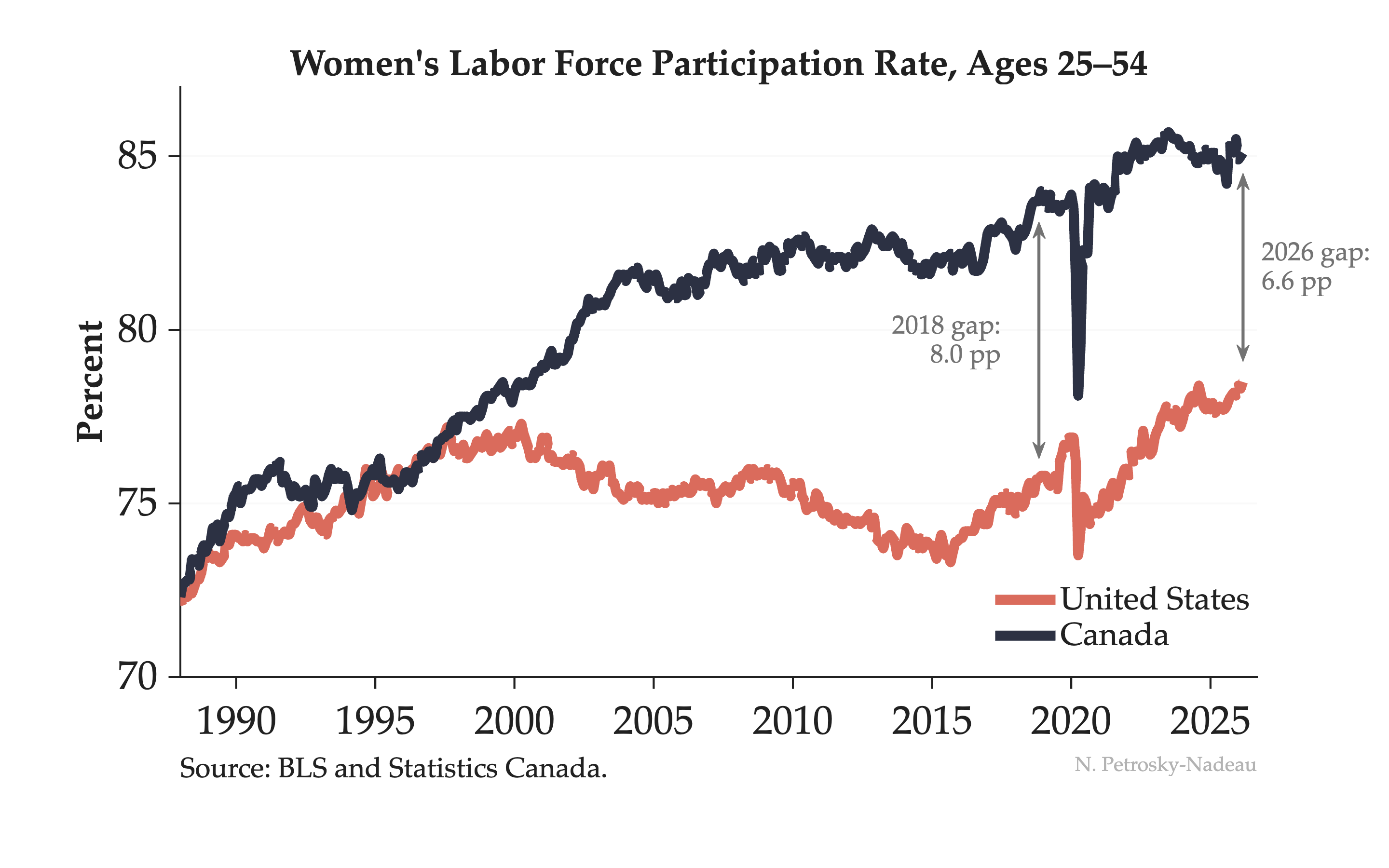
Started Together, Diverged, Now Narrowing
In 1988, women's labor force participation in the US and Canada was nearly identical — both around 72%.
Then the paths split. Canada kept climbing. The US peaked around 2000 and stalled for two decades. By 2018, the gap had widened to 8 percentage points. But look at the salmon line recently — US women's participation has surged to a record 78.5%, narrowing the gap to 6.6 pp.
Economic Post · May 2, 2026 · Download Data (CSV)
Fourteen Months in Place
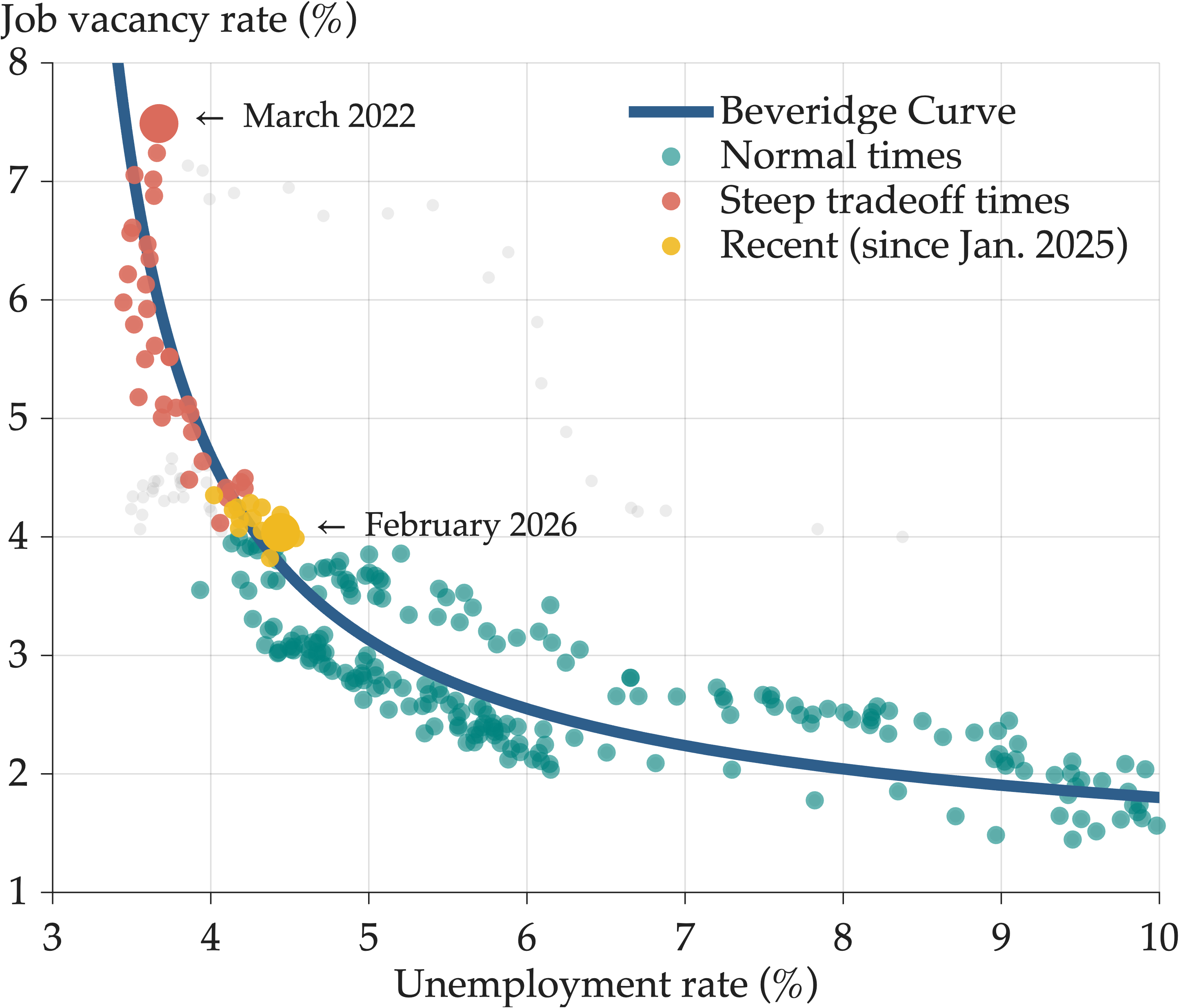
Fourteen months. That's how long the labor market has been stuck at the same point on the Beveridge curve.
Coming out of the pandemic the story was a steep favorable tradeoff—vacancies falling along the steep portion of the curve with little change in unemployment. The yellow dots show what happened next: nothing. Since January 2025, we've hovered at 4% unemployment and 3.5-4% vacancies month after month.
The descent stopped. Now we wait to see which direction it breaks in 2026.
Economic Post · April 17, 2026 · Download Data (CSV)
The Benchmark Moved
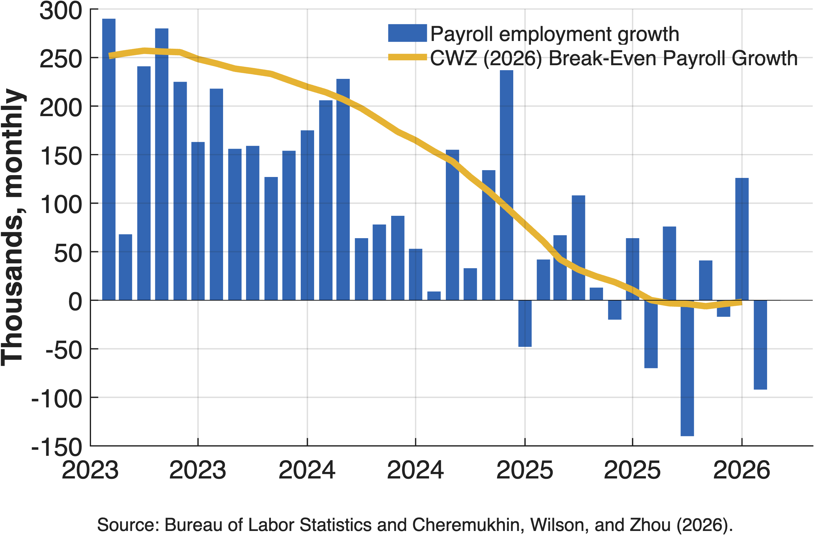
Recent job growth averaging around 20k per month looks soft. But is it?
Timely analysis by Dallas and San Francisco Fed economists shows break-even employment—the job growth needed to keep unemployment stable—peaked at 250k monthly in 2023, fell to 10k by mid-2025, and to near zero by year-end.
The reason: Net outflows of unauthorized immigrants averaging -55k per month combined with declining labor force participation. What this means: The benchmark moved. Payroll gains that would have signaled economic slack just two years ago are now consistent with a balanced labor market.
Economic Post · April 15, 2026
Labor Market Insights Videos
Animated data visualizations exploring labor markets
How Much Hiring Is Enough?
Payrolls fell in July 2026, yet unemployment eased to 4.1%. The bar for “enough” job growth is not fixed: as labor force growth slowed, from fewer new arrivals from abroad and less participation growth at home, the hiring needed just to hold unemployment steady dropped from about 193,000 a month to 11,000. A 12-month hiring average of 26,000 is weak by any standard, and still above that much lower bar. Explore the underlying estimates on the breakeven payrolls dashboard.
August 2026 · Labor Market Insights
What is the Beveridge Curve?
The Beveridge Curve captures the inverse relationship between unemployment and job vacancies. After an extraordinary post-pandemic period of steep tradeoffs, the labor market has returned to the normal part of the curve and changed little since early 2025.
May 9, 2026 · Labor Market Insights
Trends in Women’s LFPR — Canada and the US
Women’s labor force participation in the US and Canada tracked closely until 2000, then diverged sharply. Post-pandemic, the US has surged to a record 78.5%, narrowing the gap from 8.0 to 6.6 percentage points.
May 2, 2026 · Labor Market Insights
FRBSF Economic Letters
The Recent Slowdown in Labor Demand and Supply
FRBSF Economic Letter 2026-02, January 2026
What's Driving Labor Force Participation Among Women?
FRBSF Economic Letter 2025-04, February 2025
Breakeven Employment Growth
FRBSF Economic Letter 2024-18, July 2024
To Retire or Keep Working after a Pandemic?
FRBSF Economic Letter 2024-08, March 2024
Reducing Inflation along a Nonlinear Phillips Curve
FRBSF Economic Letter 2023-17, July 2023
Finding a Soft Landing along the Beveridge Curve
FRBSF Economic Letter 2022-24, August 2022
Estimating Natural Rates of Unemployment
FRBSF Economic Letter 2022-14, May 2022
Unemployment Insurance Withdrawal
FRBSF Economic Letter 2022-09, April 2022
Parental Participation in a Pandemic Labor Market
FRBSF Economic Letter 2021-10, April 2021
Contrasting U.S. and European Job Markets during COVID-19
FRBSF Economic Letter 2021-05, February 2021
Did the $600 Unemployment Supplement Discourage Work?
FRBSF Economic Letter 2020-28, September 2020
An Unemployment Crisis after the Onset of COVID-19
FRBSF Economic Letter 2020-12, May 2020
Unemployment: Lower for Longer?
FRBSF Economic Letter 2019-21, August 2019
Why aren't U.S. workers working?
FRBSF Economic Letter 2018-24, November 2018
Job-to-job transitions in an evolving US labor market
FRBSF Economic Letter 2016-34, November 2016
Changes in Labor Participation across the Household Income
FRBSF Economic Letter 2016-02, February 2016